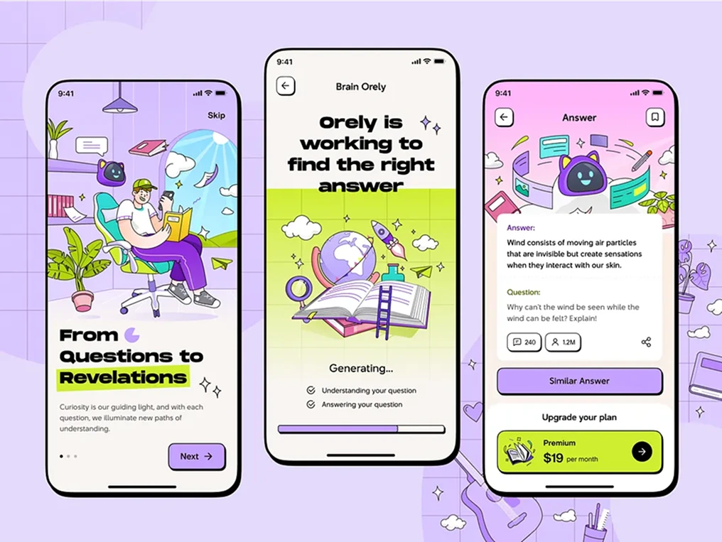
what did i learn from building this website?: pt. I. design
taking things for granted is a human instinct when something is common enough to blend into your daily life without getting noticed. websites, posters, ads and typography are the prime examples. they are so ubiquitous that you won’t really stop to ask why they’re designed in the way they are. and when something goes slightly off, people complain but they can’t articulate the root cause. in some ways, it’s positive because you can argue that “great design is transparent”. however, to solve the actual problem, i’m a strong believer in “learning by doing” and that’s why i’m writing this article to document what i’ve learned from building this website.
table of contents
- i. inspiration: hip hop & destroy lonely
- ii. typography: helvetica is king
- iii. colors: pure black is no longer taboo
- iv. layout & design system: creativity = idea stacking
- v. conclusion
i. inspiration: hip hop & destroy lonely
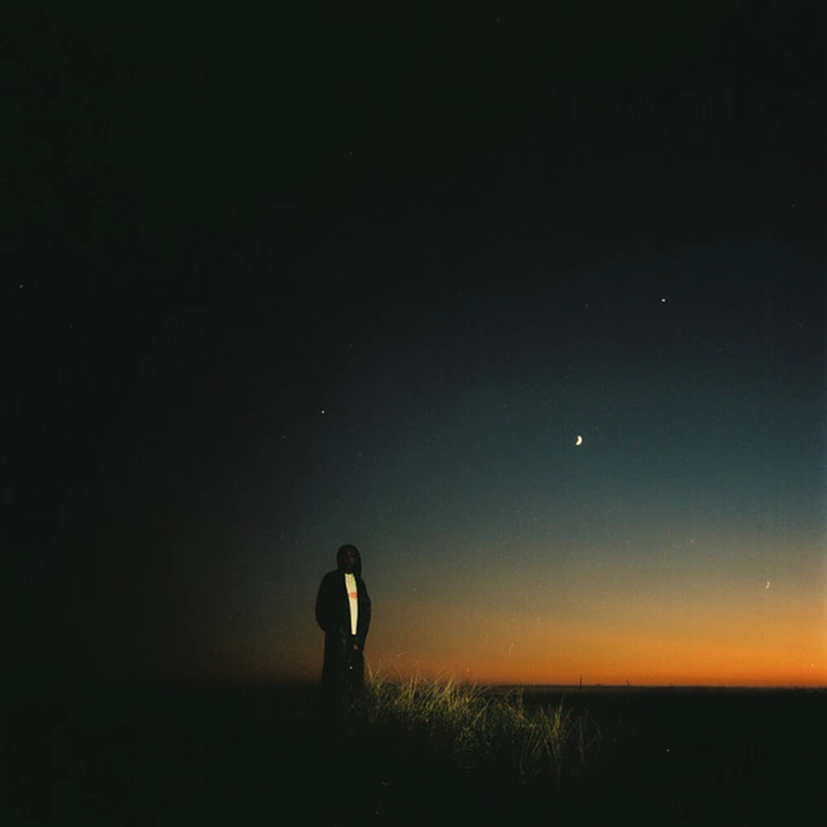
i love hip hop culture in many dimensions, and what it stands out the most to me is its boldness and cohesiveness of the artists’ image beyond music. for example, opium, playboi carti’s music label which is known for its dark and vampire-inspired aesthetics. this can be seen in their members’ music, mvs, concert posters, album cover, fashion, and much more. as a result, this established a “cult-like” fanbase because people can resonate more to them by imitation. not everyone is a music producer but people can easily dress like them or create art inspired by them.
 |  |
|---|---|
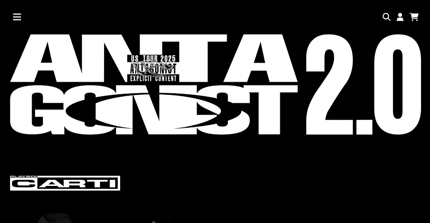
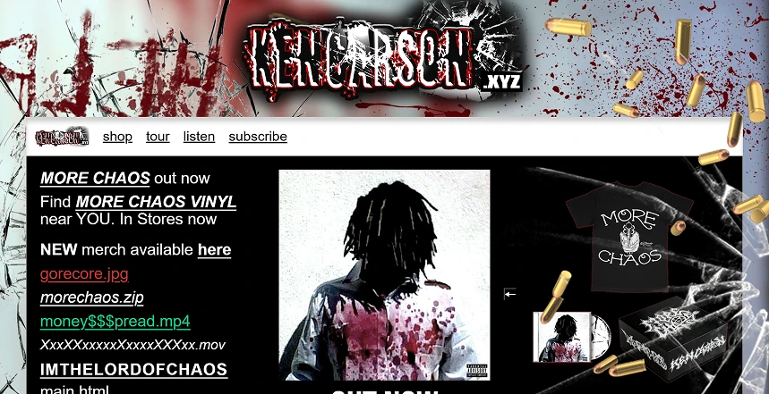
| playboi carti’s website | ken carson’s website |
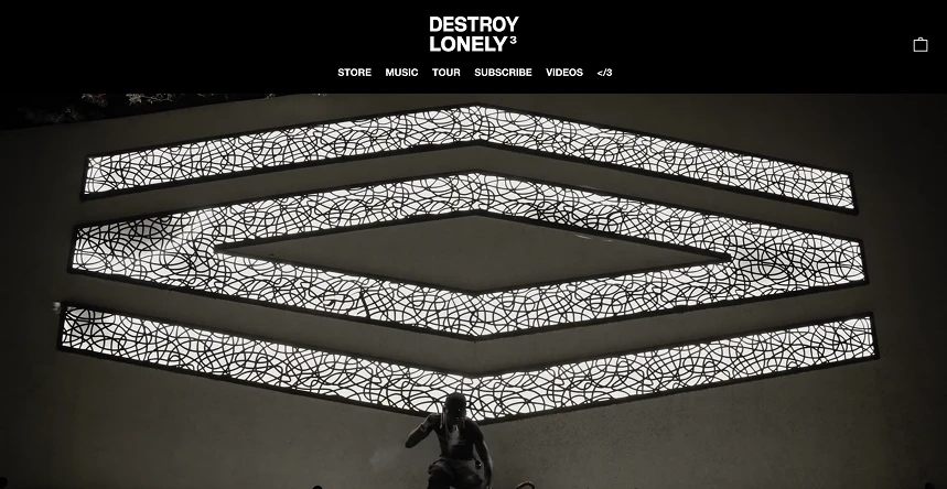 | 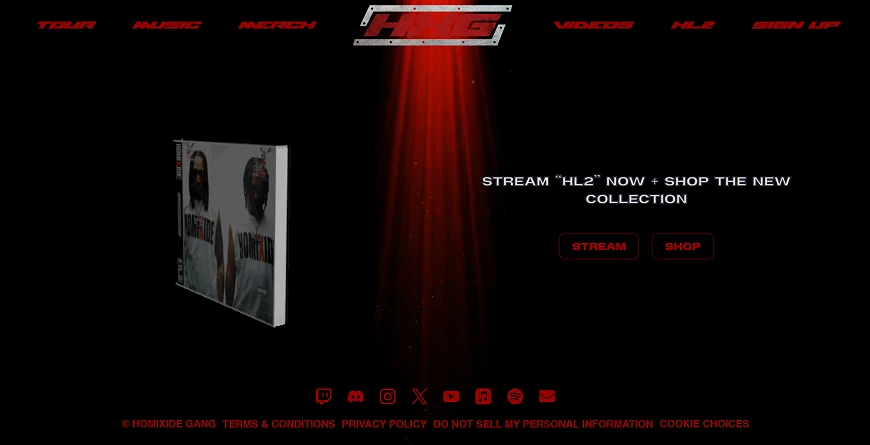 |
| destroy lonely’s website | homxide gang’s website |
from playboi carti’s avant-garde to ken carson’s chaos, destroy lonely mixes both sides of the world. his visual identity comprises of high fashion noir and atmospheric vibes, yet it’s balanced and structured. coincidently, structuredness is favorable in the web design world because its predictability makes it more versatile for the style to be applied on different screen sizes aka responsive design. therefore, as a big fan of lone’s music and a web dev, making a website influenced by his visual language seems like my perfect and natural way to appreciate hip hop/opium as a culture.
ii. typography: helvetica is king
 | |
|---|---|
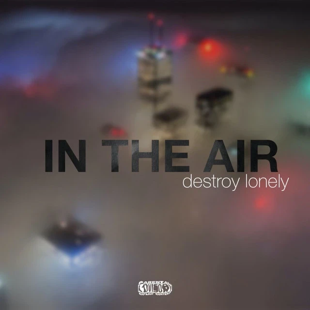
| ”IN THE AIR” cover art | my very first website logo |
“in the air” is one of my favorite songs from lone and its cover art is where all the inspirations came from. as simple as a helvetica bold song title, a helvetica light artist name with a blurred and ambient skyline background, it complements the music so well that it makes me feel like i’m in an otherworld (definitely not glazing it’s that good). meanwhile, it was also my first time to realize the importance of typography and how it can determine the whole atmosphere of a media.
later, with more research on typefaces and helvetica, and observation of my surroundings in real life, i concluded these points of why it’s so perfect for me as a design newbie.
1. utility
 |  |
|---|---|
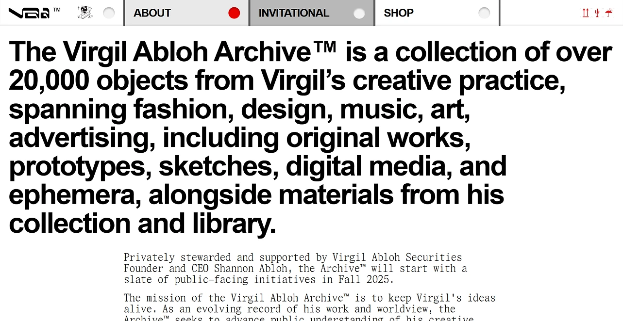
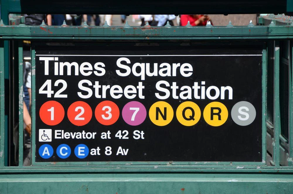
| virgil abloh’s website - legendary designer who popularized helvetica in fashion, off-white, in 2013. | new york metro signs - one of the earliest adopters of helvetica in transportation (1980’s). it’s also used in hong kong road signage in the early 2000’s. |
 |  |
| ysl logo - hedi slimane’s controversial logo rebranding with helvetica in 2012, later considered a major success in attracting younger audience | nasa space shuttle - nasa claimed helvetica as their “most important” font in their graphics standards manual (pg.27) published in 1976 |
the first and the most obvious point is the utility. there’s a reason why you can spot them everywhere, from digital to real life. its visual striking and rigid look made it the most iconic typface in swiss design movement. in particular, the concepts of a modular grid system, asymmetrical layout and sans serif fonts still contribute to the main visual identity of many ui/ux design after 50 years.
2. versatility
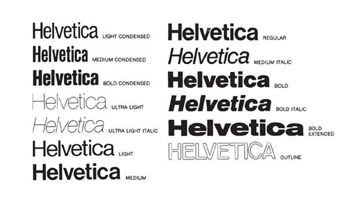
to a design newbie, fewer fonts means fewer hassles. helvetica is exactly that type of do-it-all font. it is a huge font family with weights from ultra light to black, and different variations like italic, condensed and extended. bold for decorative text and light for reading text. simple as that.
3. human
while previous points can be applied to other sans serif fonts, this one is more personal and subjective.

serif fonts are described to be more “human” because it mimics humans’ handwriting. however, its excessive “feet” and inconsistent stroke widths make it to be contradictary to the grid system. as a workaround, helvetica is geometric while still keeping that human touch because it inherited part of the serif features. for example, the little tail in lowercase a and the tail in the uppercase r, compared to more modern font like gilroy and inter. it makes the design more lively and less robotic, exactly the route i’m going for when designing a personal website.
iii. colors: pure black is no longer taboo
speaking of colors, using black is a no-brainer because of the noir fashion from opium. interestingly, among different shades of black, #000 (pure black) has been argued against by digital designers for decades, saying it’s unnatural and causes eye strain. in my stance, however, pure black was discouraged mainly because old lcd screens can’t display “real” black as the pixels can’t be truly turned off. pure black provides these advantages that can’t be replicated by other blacks:
1. great contrast (if executed properly)
physically and mathematically, it has the highest possible dynamic range of all colors, making vibrant colors pop and punchy. just note that extreme contrast is not equivalent to great readability.
2. ultimate minimalism
to me, pure black is the gold definition of void, even its hex code #000 says so. no light and extra distractions, making people only focusing on the actual content you want to present.
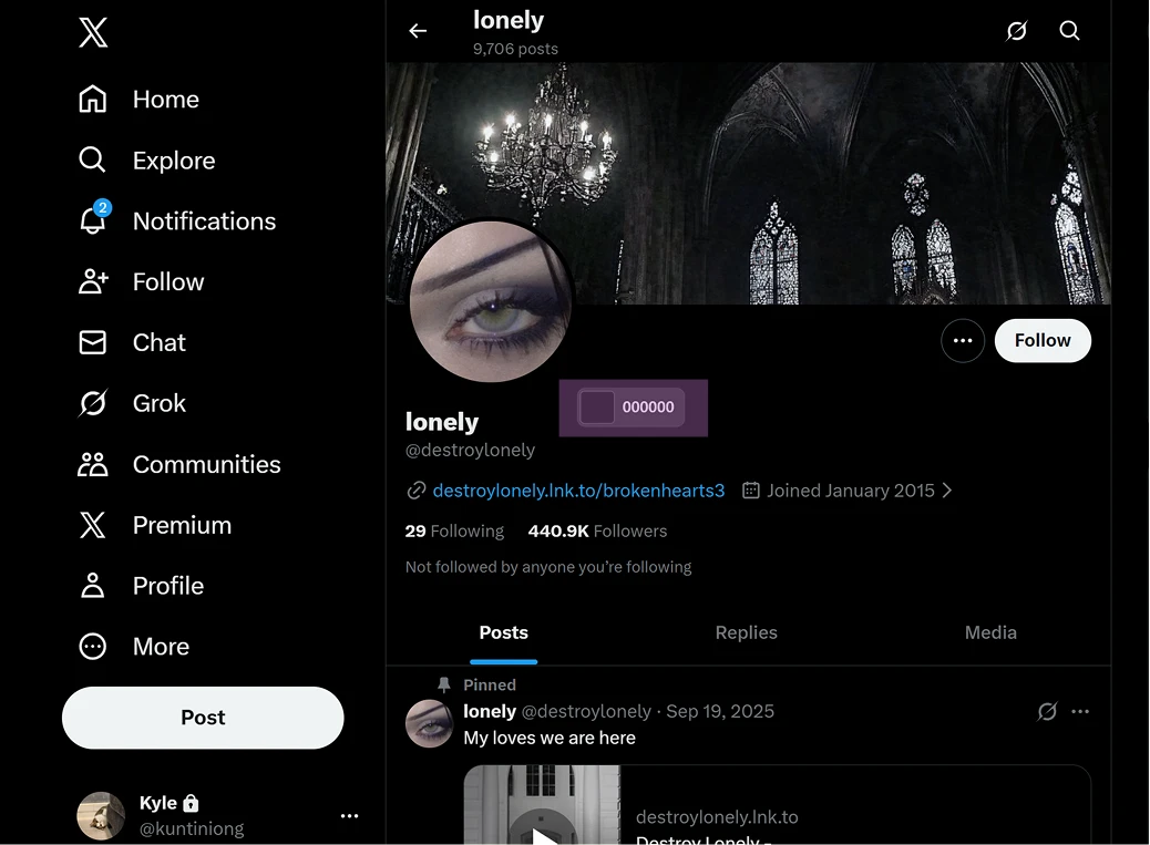
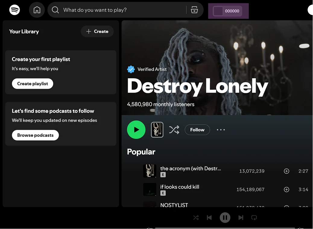
here’s the examples of production websites adopting pure black as their primary color.
 |  |
|---|---|
| x - text-heavy | spotify - visual-heavy |
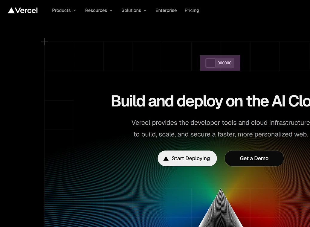 | 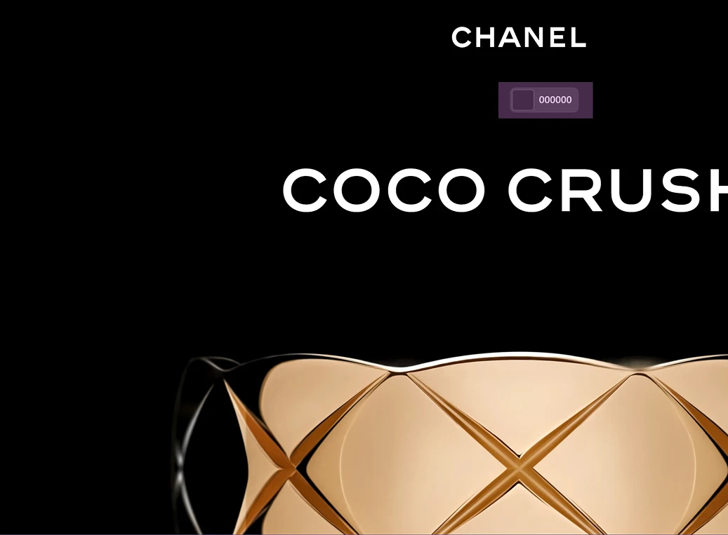 |
| vercel - corporate | chanel - luxury |
so i think it’s a shame that we forbidden the use of pure black. there are so many unique edges to it and designers should reconsider them again with the rising of oled screens.
iv. layout & design system: creativity = idea stacking
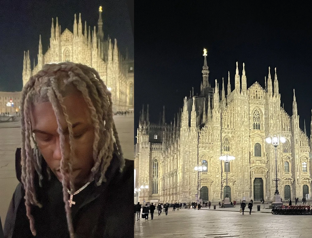 | 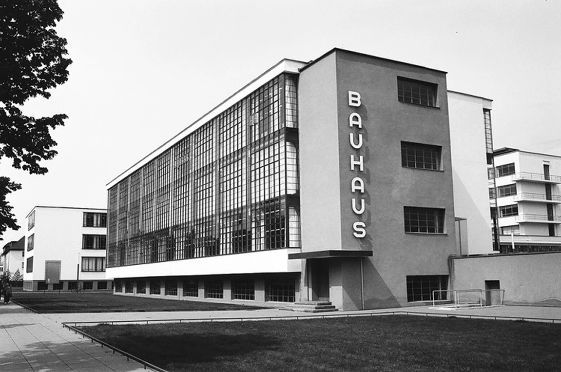 |
|---|---|
| lone’s standing in front of Duomo di Milano - one of the most iconic gothic cathedrals | bauhaus school - one of the pioneers to advocate functionalist and modernist designs, blurring the line between fine arts and applied arts |
“why so many artistic movements are driven by architecture? like gothic and bauhaus?” this question has been stuck in my head for a long time (maybe because my closest friends are architecture students) and i got this answer from chatgpt: “function and availability. you can avoid galleries but you can’t avoid streets.”
in my opinion, ui/ux is the “new architecture” of this era as you can see the waves of y2k, frutiger aero designs taking all over the places. fundamentally, architecture and ui/ux are both highly available and functional. sometimes they might even have interinfluence on each other like brutalism and neobrutalism.
as much as i want to choose a gothic theme to match lone’s visual language, executing a gothic theme without a designer background is extremely difficult. therefore, i chose to go brutalist in my design system because that’s the closest thing to opium’s boldness and minimalism.
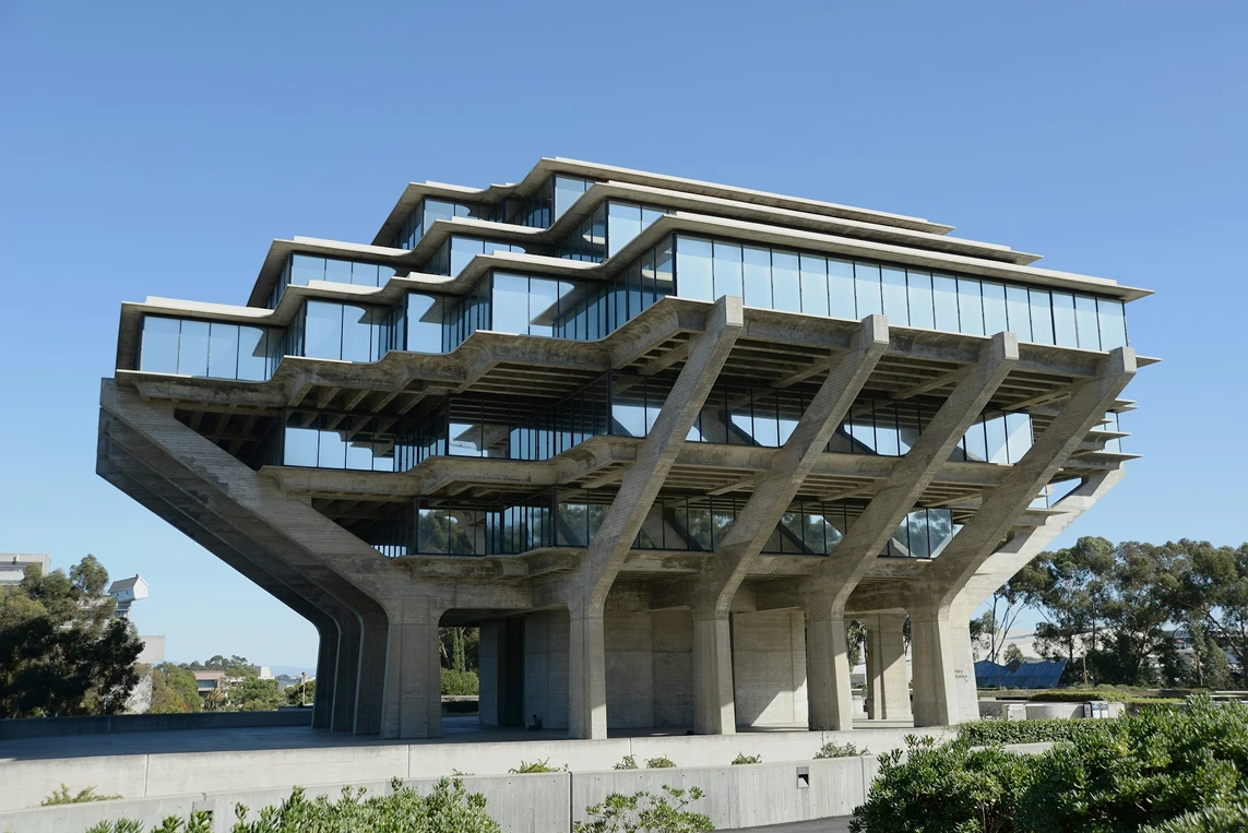 |  |
|---|---|
| brutalism - strong geometric forms, emphasizing on the raw textures of the material | neobrutalism - reimagination of brutalism in the digital world; create contrasts using neon colors, heavy use of opaque colors and hard shadows |
in conventional brutalism, i concluded that i like the concepts but i dislike the execution. what i meant by that is i like the geometric form involved in brutalist buildings, but i dislike the use of exposed, unpolished raw concrete. similarly, in neobrutalist ui/ux, i like the rigid borders and hard shadows, but i dislike clashing bright colors.
so i made small changes to neobrutalist ui/ux design by using the infamous 3% rule from virgil (fun fact: he studied architecture too) to build my own design system. he stated that innovative designs are created by alternating only 3% of the pre-existing concepts and that’s exactly what i did here:
1. monochromatic with functional colors
instead of jamming neon colors, i chose to get back to the basics. just like brutalism, colors are not the spotlight but the layout and shapes are. i mainly use monochromatic colors to match the opium aesthetics. at the same time i’m not banning other colors but they should be functional (e.g. categorizing/highlighting information).
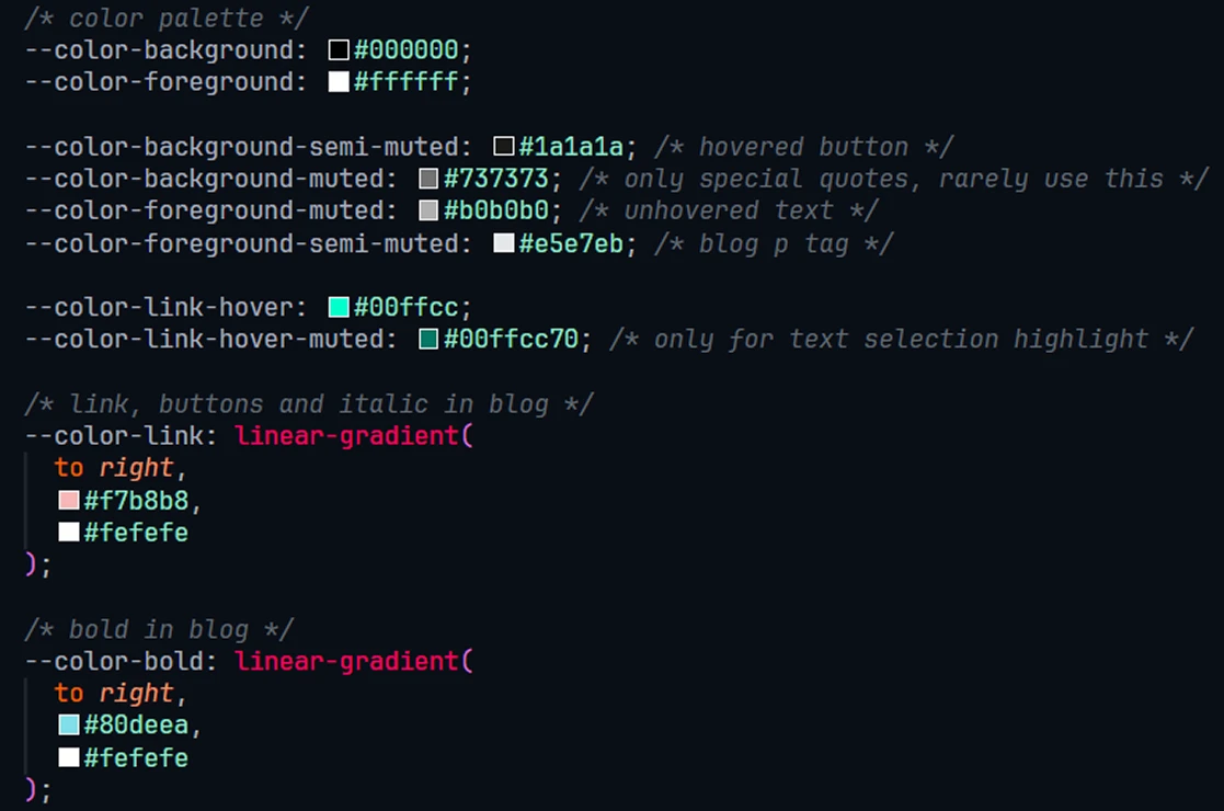 | |
|---|---|
| color palette of my website - each color is strictly defined to serve a purpose | proper highlight to draw attention to my logo |
2. textures
as colors are pared back and pure neobrutalism only uses opaque colors, so i add textures to compensate that part of the visual agility in my system.
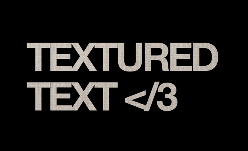 | 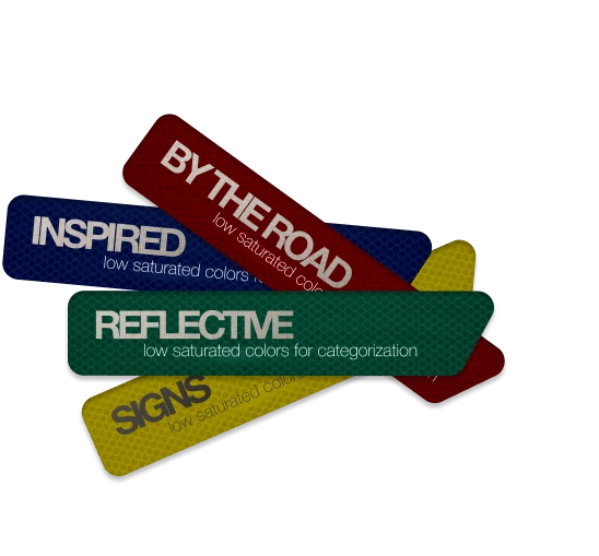 |
|---|---|
| the fabric texture resembles the beige color used in rick owens garments, which are heavily worn by opium members | 3m reflective texture inspired by street signs because “you can’t avoid streets.” |
3. stay true to the original concepts
all changes are meant to add depth and novelty to the execution. original ideas like the highly modular containers with distinct borders and hard shadows are kept. i’m not recklessly mixing whichever trending styles (e.g. glassmorphism, skeuomorphism) and chasing the clout.
 |  |
|---|---|
| lone’s ns+ (ultra) album cover | preserving the original concepts with personal touches like the gradients |
v. conclusion
to wrap up, i don’t want to exaggerate but i can confidently say this project is really life-changing to me. it’s the first time for me to really organize my random inspirations i encountered in daily life and translated it into a cohesive, world-building design system. it forces me to think like a designer, pay attention to details and have the motivation to ask “why” behind the design choices. now me writing blog posts and making regular updates to my website is lowkey like terry davis tinkering around with his templeos, very enjoyable and fulfilling.
lastly, creativity almost never comes in linearly, it’s meant to be jumpy and mess, and this sparks innovation. so my design style is still evolving as i learn and observe more. stay tuned for pt. II: technicals.